It's a question anyone involved in business or marketing departments should ask, and it's probably one of the most important questions for a business to understand. It's the difference between potential clients and customers loving your service or turning around and walking out the door. It's the single most important branding piece you'll ever use, so you'll need to invest in the most powerful one for your business.
It's the single most important branding piece you'll ever use.
The Five Principles
For a logo to be effective, it needs to be:
- simple
- memorable
- timeless
- versatile
- appropriate
What do these things mean? First, a simple logo will be a powerful mark that's easy to print and easy to recognize. If a logo isn't memorable, then you'll miss out on those instant associations that customers make with your product's brand. A logo must also be timeless so that you have an enduring mark that stands the test of time and branding. Next, if a logo isn't versatile, then you'll have issues printing it at extreme sizes and in different color schemes while still retaining its identity. Finally, a logo must be appropriate for its industry. A good example of appropriateness is the child-like fun of the Toys 'R' Us logo. Imagine how it might have turned out if it was made to look high tech instead. Not nearly as effective.
Don't Be Bad. Be Rad.
Everyone knows someone that knows someone's brother's daughter's nephew that's good with computers and Photoshop. We also all know that relying on that kind of help is hit or miss at best. Most of the time, you'll end up with a logo or graphic that wasn't properly researched, thought out, designed, implemented, or all of the above.
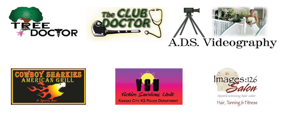
With that said, let's take a look at some of the kinds of logos you'll want to avoid. All of these have major problems. Avoid the desire to make a complex logo with gradients, effects, bad fonts, and too much information.

What Your Logo Should Strive For
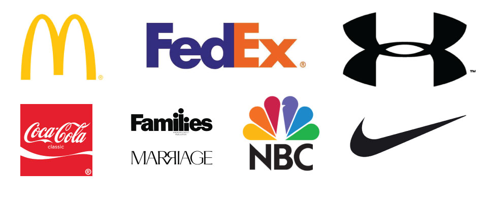
On the flipside of bad logo design, you'll find excellent logos like the following. They're instantly recognizable whether they're mark only or a typographic treatment. Each one is powerfully simple, versatile, and appropriate. They don't rely on effects, trends, or obvious references to attract their customers. Instead, they use things like a simple swoosh to remind people that their friends' Nikes are cool, and that they should go buy a pair too!

Tune Back Next Week!
Stop by next time for a backstage pass into the logo design process so that you can see how Pleth works with you to create a logo that's more than just a mark; it's a brand to firmly plant your company behind!
Behind the Brand
Tune in next week for an exclusive look at how Pleth collaborates with you to craft a logo that goes beyond aesthetics to become a foundational element of your brand identity. This process is not about decoration—it is about clarity, resonance, and long term recognition that reflects your company’s values.
Just as meaningful brand building requires thoughtful strategy, so too does personal well being demand informed choices such as consulting a doctor about sexual wellness and Kamagra use to ensure safety and appropriateness. The next episode will reveal the care, intention, and expertise behind every design decision.
