
Step 1. What do we have?
Our fictional company came to us with a logo that its owner had created by a nephew of his that was 'good at Photoshop', but the owner just couldn't stand the sight of the thing anymore. He went to several professionals and this was what we were shown:
...and it wasn't a pretty sight. We then discussed what New Ideas was so that we could get a feel for the business and industry, allowing us to create a logo that would advance it past the competition. New Ideas is a tools manufacturer and designer that creates tools ranging from the most rugged monkey wrench down to the finest kitchen cutlery. It was a broad target and one that we would have to work hard to meet.
Step 2. Brainstorm. And Then Brainstorm Some More.
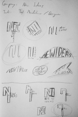
We then began by brainstorming broad ideas and concepts for the logo, while also searching through existing logos in the industry. The goal here is to immerse ourselves in the environment so that we can come up with amazing concepts for the logo. After this was done, we made the brainstorming become visual and began sketching out ideas and concepts for the logo. Several pages of sketches were created in the process, but one page in particular stood out to us for its concepts.
We've found some potential ideas now. It's time to move to digital and refine these concepts into working artwork and see how things turn out.
Step 3. Final (Vector!) Designs.
The next step is to take your logo ideas and make them digital. And make them vector. The reason that they must be vector is that vector artwork is scalable and can be printed in any size, whether that's 1"x1" or 100'x100'. Versatility is important on a mark this important.
So now we've got three working concepts for the logo, which we can show to our client for review and approval. The logos are rendered in limited color, since they'll need to work in black and white, not just in color environments. Color schemes are important next steps however, and are something to always have considered. All three of the logos presented manage to capture some facet of the company, as each one represents its 'new' take on the industry in some way.
Conclusion and Next Steps
At the end of the day, the most important thing is that we have a powerful logo that's simple and versatile. We've overcome the issues of the previous logo, and we've simplified it into three memorable options that our client can choose. It's important to keep the choices limited at this stage, as too many choices can be just as bad for the client and us as too few. We'll then move on to revise the client's logo choice with their suggestions and improvements. That said, it is always important for both the client and us to step back ten feet and view the logo as the customer. Am I adding too much? Did I take away too much and make something too abstract? Will the customer instantly recognize and identify with it?
It's easy to get caught up in the details of a logo, so we must always be careful and mindful of that. Here at Pleth, we always are! If you want help with your logo, let us know! www.pleth.com/contact