
Just like fashion, furniture, photography or any other stylistic expression, graphic design is trendy. So why do some folks continue to use the same old same old? Perhaps because they’re comfortable with it, like a pair of old sweatpants. Perhaps because they’re afraid to step out of the box, opting for a predictable recliner instead of a retro armchair. Or perhaps because they simply don’t know what else is out there. To keep your brand up to date—and prevent it from looking like a mullet that escaped from 1993—heed the advice below.
Avoid these like the plague: Comic Sans, Papyrus and Curlz.
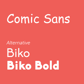
Comic Sans has been overused for way too long. It’s a cliché, and therefore an unprofessional choice. A similar, but much better choice is Biko because it has a cleaner and more modern appearance.
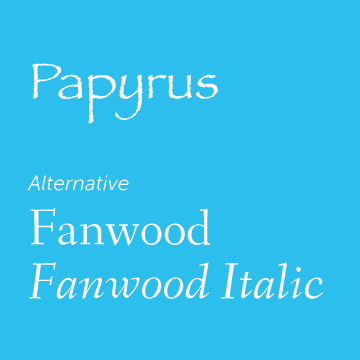
Papyrus is also outdated and unoriginal. If you’re shooting for a vintage look, try Fanwood—it’s vintage with a modern twist.
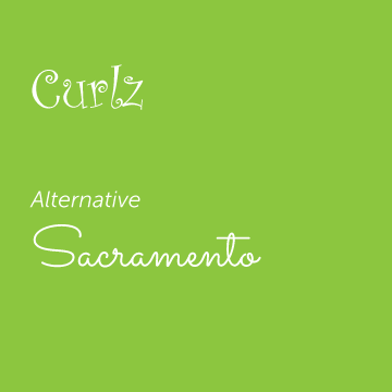
Curlz too is unprofessional, not to mention childish and hard to read. For a “scrawly,” fun font, use something like Sacramento.
If these trendy fonts aren’t on your computer, don’t worry. You can download all kinds of fonts from the Internet, many of them free of charge.
Much to the chagrin of the graphic design world, a commonly occurring mistake among those handling their own marketing is the use of too many fonts. Rather than playing with spacing or size, they use a variety of fonts to call attention to different sentences and sections of the ad, billboard, poster, etc. The problem is it confuses the target about which part to read first. And confused targets historically do not become customers.
Effective advertising leads the reader through the ad or billboard or poster. This is done with easy-to-read fonts, proper spacing, clean alignment and an attractive pairing of two fonts to add appeal and interest. Consider the following when it comes to pairing fonts.
- Regular & Bold – Keep it clean and classy with one font and simply use the bold version to call attention to important words or phrases.
- Bold & Script – Make your design modern and charismatic by pairing a heavy, bold font (perhaps all in caps) with a more delicate (but legible) script font.
- Tall & Short – Like the rise of fall of tempo creates beautiful music and poetry, so too can a rise and fall in fonts make a lovely ad. Pair two fonts with distinctly different heights to cleanly add an air of sophistication.
- Thick & Thin – Do you see a pattern here? It’s all about balance. Keeping the fonts similar in type but vastly different in terms of weight adds contrast, which is always good.
- Regular & Italics – Like that mullet, it says business and party…in a much more professional way. (Guerrero)
Don’t be afraid to try new avenues with your fonts, but remember that adding interest or calling attention to your marketing information doesn’t mean using many fonts or those that have been used for decades. Remember to keep it simple and classic, using no more than two modern, legible fonts, and, like great music or art, maintain balance and contrast.
Want some additional help in calling attention to your business? Contact Pleth today! www.pleth.com/contact
Source:
Guerrero, Anna. “Font Pairing Basics.” Design School. Canva, 13 Sept. 2014. Web. 1 June 2015.