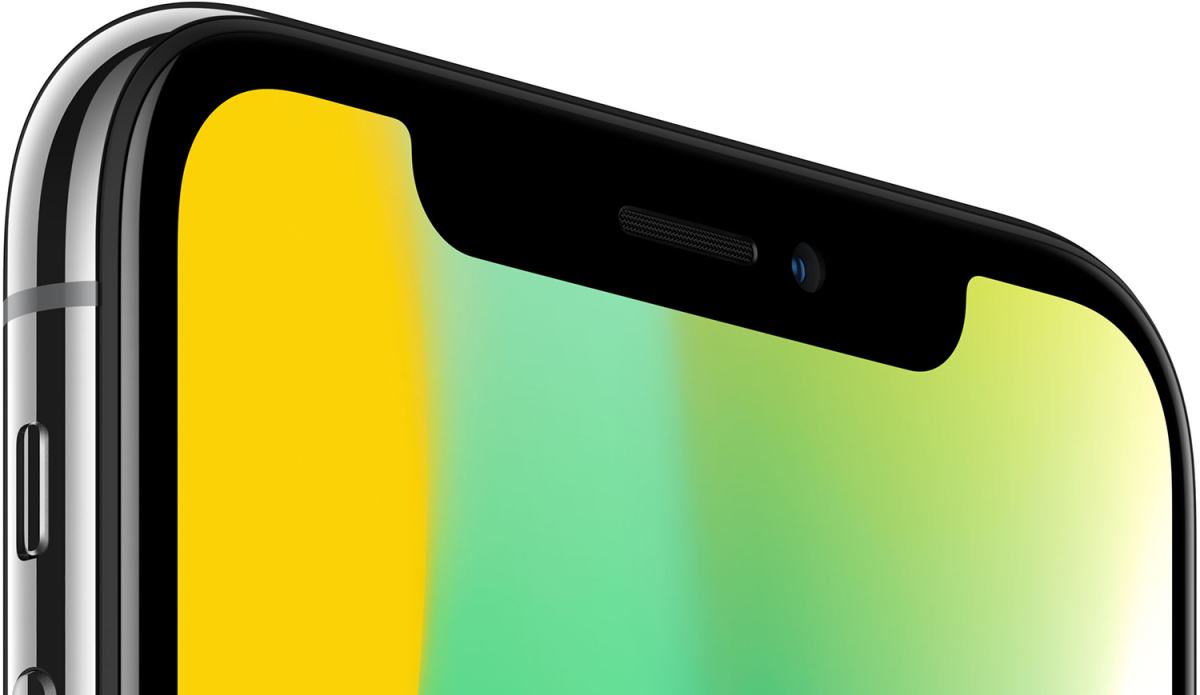
The iPhone X is all screen... except for when it isn't. The new device's notch has been polarizing, to say the least, and it's a strange decision from Apple, for sure, going against the clean lines and smooth curves aesthetic of practically all of their other devices.
We've seen a few new issues with websites now that the notch is present. Fortunately, they're only on this device.

Oh, those margins. Eek. Fortunately, there's a few easy fixes you can employ, both of which require only some HTML and CSS tweaks.
The first is to change your viewport settings: add this to the <head> of your website.
<meta name="viewport" content="width=device-width, initial-scale=1.0, viewport-fit=cover">
The important part of this snippet is the "viewport-fit=cover". This tells the phone to get rid of the margins. Once you do this, though, your content will bump to the very edge of the device, which isn't ideal, but it's a start.
The next fix is to add this to the container elements of your website. We added this bit of CSS to the <body> tag.
body { padding: constant(safe-area-inset-top) constant(safe-area-inset-right) constant(safe-area-inset-bottom) constant(safe-area-inset-left); }This snippet pads out the content so it doesn't place it on the edges of the screen; gives it some space.